As the painting developed, it certainly did transform. The most notable transformation being in the colour. I found the painting became more vibrant, as my interest in the Impressionists, such as Matisse and Cezanne and van Gogh progressed. Using a paint ‘daub’ technique, as with pointillism, the variety in lighting improved as I added more colour to an area and let more of the background colours show through. This has been an important an investigation as the light and colour. I have still stayed true to my idea and the importance of the shadows, the final piece just became a little more abstracted than expected
Objective - Lounge 1 - taking the Edward Hopper study of Empty Room, I'd like to render Lounge 1, possibly using a version of colours you associate with Matisse and Van Gogh = bright, vibrant, energetic... Through my building up the piece I have realised the importance of tone VS. the importance of hue... Tone tells the eye what to look at, and how the painting is balanced. The tone, sets the ‘mood’.
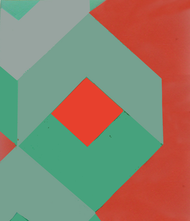
I simplified the forms out into light and dark and then continued to simplify more, by cutting out unnecessary pattern and colour. I ‘simplified’ the light/shadow forms and integrated them with the forms of the couch, beanbag, pillows and window.
Outcomes – place lightest lights next to darkest darks. Place most vibrant next to most dull. Place textured next to plain. I was not ‘precious’ with this piece. I painted it and just let it go in whatever direction suited the abstractions. The colours were experimented with in Photoshop and on canvas... Final image - keeping true to the shadows...
1. Below - Palette knife example: Using one primary (warm blue) and one complimentary colour (cool orange – cool red, lemon yellow), with both mixed together to make darkest colour. No black or white used.
2. Below - Palette knife example 2: using Photoshop to remove colour, replacing study with black, white and burnt umber filter.
>Painting over the monochromatic excercise with HUE BUT NOT TONAL variations of the same painting.i.e. The COLOUR of the paint being added on top of the original monochromatic brush stroke must be of the same TONAL VALUE.
Using the techniques of Pointalism/Divisionism used to create varied tonal contrasts in monochromatic scheme... used by the French Impressionists and Italian painters during their experimenting with light and tonal relationships.
Notes: >the shadows cast a separate colour, which can be painted as a separate form. >colour next to another colour, complimentary or tonally varied, creates a different dynamic... colours used within a scene repetedly, support the composition of the work (e.g. Buddha works - green). >variations in tone, caused by shadow can be used as form or colour to enhance composition.
Before commencing, consider what effect you want your added colour to achieve within this space. Think creatively. 2. Do you want this colour to work in a way that compliments the surrounds or will add contrast? 3. Will you add a subtle tonal shift or juxtapose complimentary colours?
>>>> Using the word 'nostalgia' to subtly change an area around the house... grew up in the 70's and 80's, so I used those colours to present my ideas...
Consider how your original observation and colour associations change with each colour as you take them through the various alterations in this excercise: What I found when putting two colours of the same hue or different tone together, was either the original colour was energised (e.g. blue and red or red and green), whilst others ‘tone down’ the energy, final (browns and beiges/cremes)
Each simplified geometric pattern is made of up: 1. MAIN HUE 2. DIFFERENT HUE BUT SAME TONE 3. TONAL VARIATIONS X2 OF COMPLIMENTARY HUE 4. SATURATION VARIATION OF MAIN HUE


